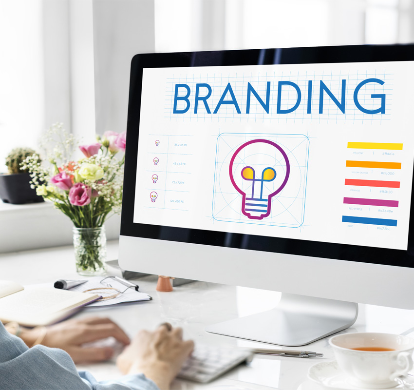
The Power of Shape in Logo Design: Why It Matters for Your Brand
What’s apparently the prime thing that pops to your mind when you hear about a brand? Of course a logo, right? Because, basically it’s the face of your business, the visual identity that people instantly recognize. But have you ever given it a thought why certain logos just click while others don’t? A lot of that comes down to one thing: shape.
As a Creative Agency, we’ve worked with a ton of businesses to help them find the perfect logo, and one of the key things we always focus on is shape. Because shapes communicate! They convey a message, evoke emotions, and even help in building trust with your audience. So, how do shapes in logos work? Let’s break it down.
Why Shape Plays a Crucial Role in Logo Design
You might think that shapes are just a decoration. But in reality the shape itself is a language. When you see a logo your brain is processing something big over a design; it’s picking up on what that shape represents. Whether you realize it or not, we all associate different shapes with different ideas and feelings. For instance, a circle may feel warm and inviting, while a sharp triangle can spark energy and action.
What Do Different Shapes Mean in Logo Design?
Here’s a breakdown of some common shapes and what they communicate to your audience:
Circles: Unity, Trust, and Continuity
Circles are perhaps the most universally recognized shape, and for good reason. They symbolize unity, wholeness, and trust. Their smooth, continuous edges give off a sense of calm, making them ideal for brands that want to convey feelings of security and inclusiveness. That’s why we often see circles in logos for healthcare, wellness, and even tech brands that want to create a sense of reliability and comfort.
Squares: Stability, Professionalism, and Structure
Squares and rectangles convey stability and structure. They feel grounded and dependable, which is perfect for businesses that want to exude professionalism, like law firms, financial institutions, and construction companies. A square logo says, “We’re solid, reliable, and here to stay.” It’s a shape that builds trust by communicating stability.
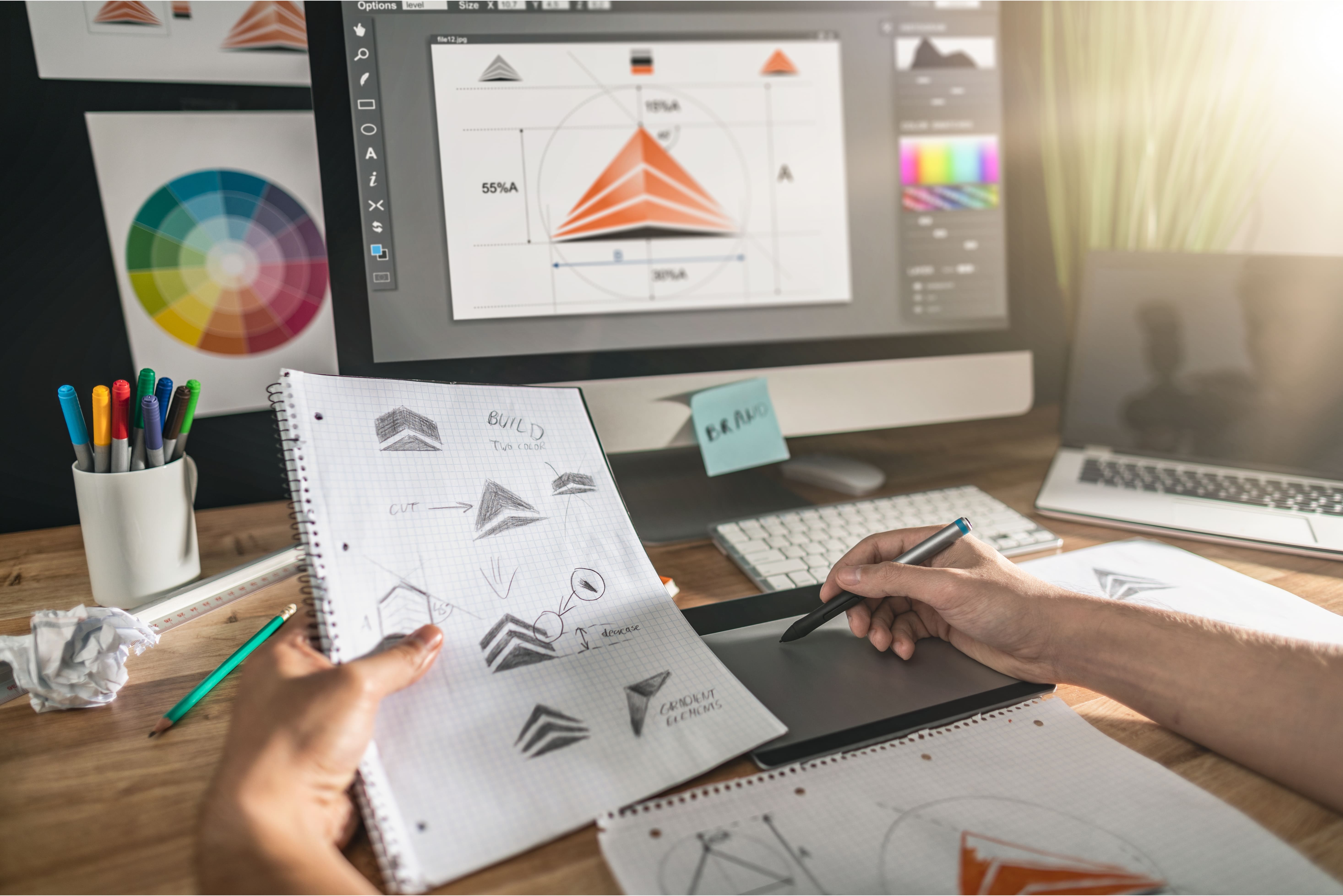
Triangles: Energy, Direction, and Innovation
If you want your logo to feel dynamic and forward-moving, triangles are a great choice. Whether pointing upward for stability and growth or angled to show direction and action, triangles are symbols of energy, adventure, and change. That’s why many tech companies, sports brands, and adventure-oriented businesses use triangles to signal movement and innovation.
Hexagons: Balance, Innovation, and Complexity
Think of the humble honeycomb. Hexagons are often used in logo design to communicate balance and harmony, thanks to their symmetrical, interlocking sides. The hexagon’s complexity also represents innovation and forward thinking, making it a perfect fit for tech, science, and eco-conscious brands. This shape suggests that your brand is multifaceted and modern—always thinking ahead.
Ovals: Elegance, Motion, and Softness
An oval logo is like a circle, but with a little extra movement and elegance. It feels softer and more fluid, suggesting grace and sophistication. Ovals are commonly seen in industries like beauty, fashion, and luxury, where the goal is to convey elegance without losing a sense of motion or growth. It’s a perfect balance between softness and dynamism.
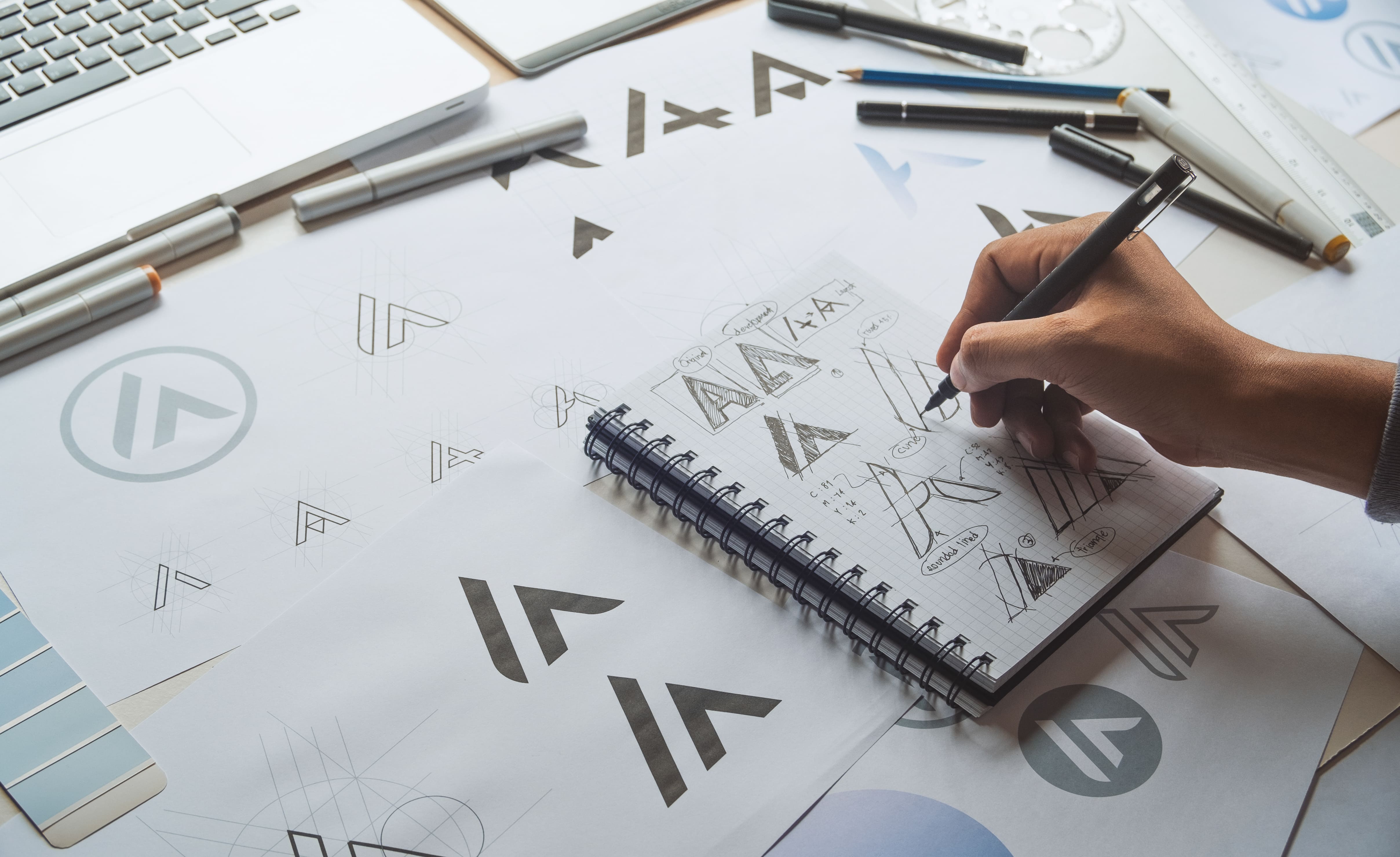
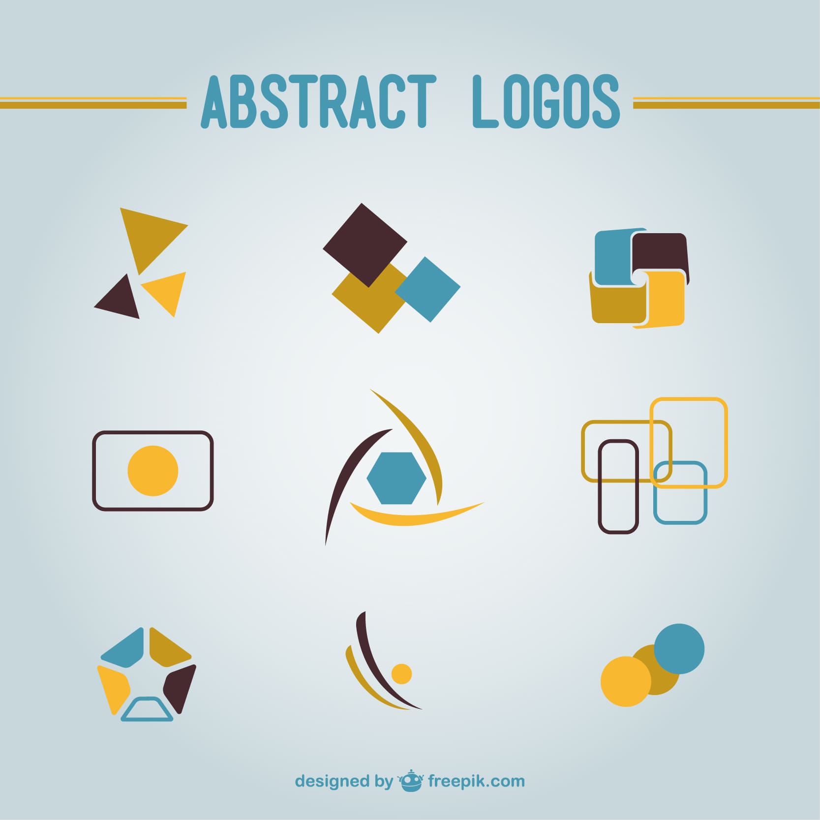
Abstract Shapes: Creativity, Uniqueness, and Identity
Then, there are abstract logos. These don’t rely on traditional shapes to get their message across but instead use unique forms to stand out and express something entirely different. Abstract logos allow a brand to be completely distinct, offering a more creative and memorable identity. For those brands that want to emphasize their innovation and individuality, abstract shapes work perfectly.
The Golden Ratio: Finding the Perfect Balance
Some of you may have probably heard of the Golden Ratio, that magical mathematical formula for creating visually pleasing proportions. A lot of timeless logos are designed with this in mind because it gives the logo a natural sense of balance that’s easy on the eyes. If you’re working with circles, squares, or even triangles, applying the Golden Ratio can help make your logo look well-balanced and harmonious.
What’s the Best Shape for A Logo?
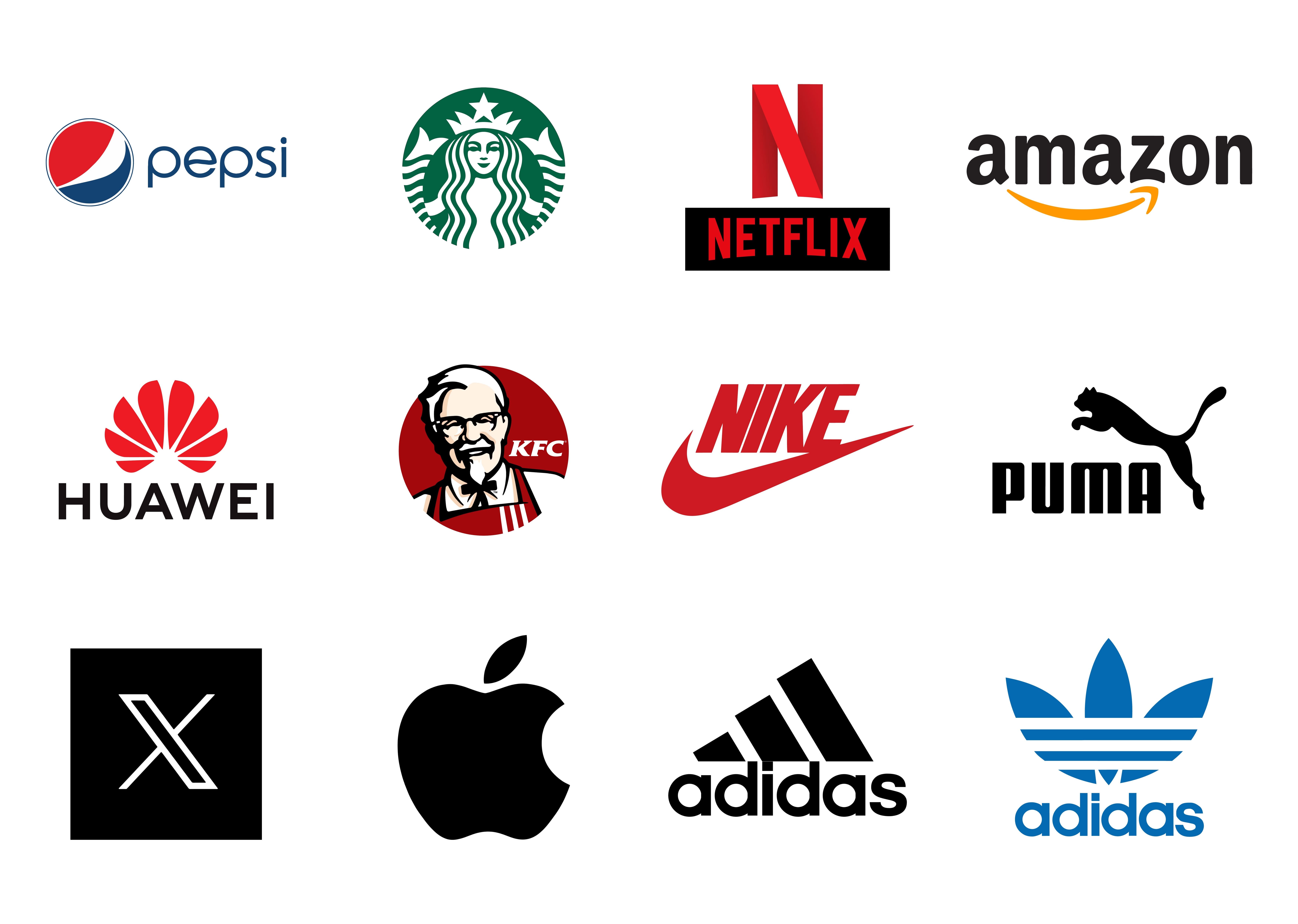
There is no one-size-fits-all answer to this, but there are a few shapes that work across a variety of industries. For example, circles are universally liked because they are simple, friendly, and versatile. If you’re in tech, health, or in retail, a circle-based logo can communicate trust and unity.
However, the best shape for your logo really depends on what your brand stands for. If you are a tech start up pushing innovation, a triangle or hexagonal shape might better represent your forward thinking nature. If you are in the legal field and need to appear stable and trustworthy, a square will get the job done.
Final Thoughts
Your logo shouldn’t stay as a lifeless shape. It should yell at the world who you are. The shape you choose plays a huge role in that story. If what you are looking for is something sleek and modern or dynamic and adventurous, the right shape can help you to ring with your audience and make a great impression.
So, what does your logo say about you? If you're not sure, let’s chat. We can help you design a logo that’s not only beautiful and aesthetic but also speaks directly to your brand's core values.
Related Articles.

How to Use Nostalgia in Holiday Advertising Without Being Cliche
Read More
The Branding Blind Spot You’re Totally Missing (And It’s Killing Your Brand)
Read More
Why Is AI-Optimized SEO the Future of Digital Marketing and How You Can Benefit
Read More
Color Psychology in Marketing and Branding: Why it Matters for Your Brand
Read More
The Power of Shape in Logo Design: Why It Matters for Your Brand
Read More

The Impact of Studio Ghibli on Graphic Design: An Artistic Revolution
Read More

You Won’t Believe These Websites Exist!
Read More

Why Does Your Business Need a Website?
Read More
DeepSeek AI: A New Era of Artificial Intelligence
Read More